October is Breast Cancer Awareness Month, so we have decided to dedicate our blog this week to all things Pink.
We came across this great quote by Dianna Vreeland (fashion icon), who was famous for saying “Pink is the navy blue of India“. We love that!
In India, they are so unafraid of using this colour boldly and in copious amounts. Maybe they are onto something…..


Pink is no longer strictly reserved for little girls rooms…..if you use the right shade in the right setting, it most certainly creates a space that is a showstopper.
There are so many shades of pink to choose from : from the more softer ballet-toned pink to vibrant hot pink; candy-cotton retro pink (think Flamingos in the Florida Keyes!) to dusty rose pink and salmon-coral pink. Delicious, uplifting, and dynamic – whichever way you look at it, the colour is fresh, fun and inviting. (and totally indulgent of all things Feminine!)


Image courtesy of Pinterest
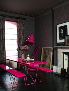
If the thought of emblazoning your lounge wall in a shade of Fuschia is far too scary, the colour works equally well as pops in accessories. Think cushions, Lampshades, artwork…a pink Smeg fridge perhaps! Pink in a patterned fabric is another way to bring in this colour.


Pink goes well with a variety of other different colours:
- CHOCOLATE, BLACK + GREY will give it a modern maturity and really elevate the colour to something grown up and sophisticated
- WHITE + pink is a timeless combination that remains eternally fresh and inviting.
- CREAM + pale dirty pinks are evocative of French décor scenes..ala Marie Antoinette
- ORANGE +brighter tones of pinks are great friends! This is a fun, fresh and vibrant combination.
- METALLICS + pale pinks are a match made in heaven. Oh-so-glam!